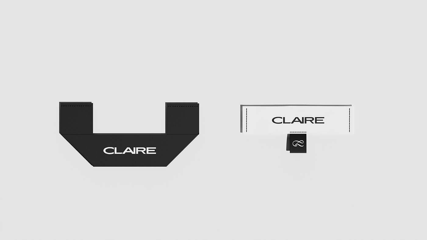
在Claire的设计中,我们期望品牌能够成为一座具有“生命力”的桥梁,从而连结起品牌、市场和消费者。尝试了很多以桥梁为视觉核心展开的设计后。我们发现这其实是新的框限,之后抛开了所有附加情绪价值,回归找寻“生命力”的出新。 多次尝试后,我们意识到针织物的层次感或者说是层叠效果才是我们寻找的“生命力”的最好体现。清晰的秩序,织物之间的连结,聚沙成塔的效果,是这座桥梁最合适的表达,也是当代年轻人的最好展现。
In the design of Claire brand, we aspired for the brand to become a vibrant bridge, linking the brand, market, and consumers with vitality. After exploring various visual designs centered around the concept of a bridge, we realized it became a new limitation, diverting us from the core essence in search of "vitality." Following multiple attempts, we came to the realization that the layering effect or texture of knitted fabrics truly embodies the "vitality" we sought. The clarity of order, the interconnection between fabrics, and the cumulative effect resemble the construction of a bridge, the most suitable expression. It's also the perfect portrayal for the contemporary youth—a representation of vitality.


